I don't understand this chart
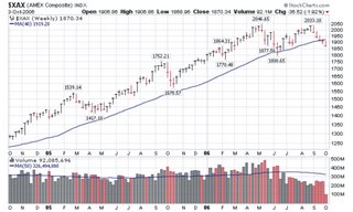
Yesterday I posted some remarks about the lack of small and micro cap participation in this "rally". I wanted to follow up the post with a chart of the AMEX composite.
This chart look ominous. The weekly tried to make new highs on dramatically smaller volume, then turned down and now has broken the 40 week moving average. Overall, the AMEX looks to me like it has put in a double top.
What the heck does this mean? I have no idea and I can't seem to find any information about it either. All I know is that the AMEX has made a fantastic run in the last few years and it looks like the good times are over. Will the NYSE and Nasdaq follow? We shall see, but I'm going to continue to be cautious.
Go Dodger Blue!


No comments:
Post a Comment